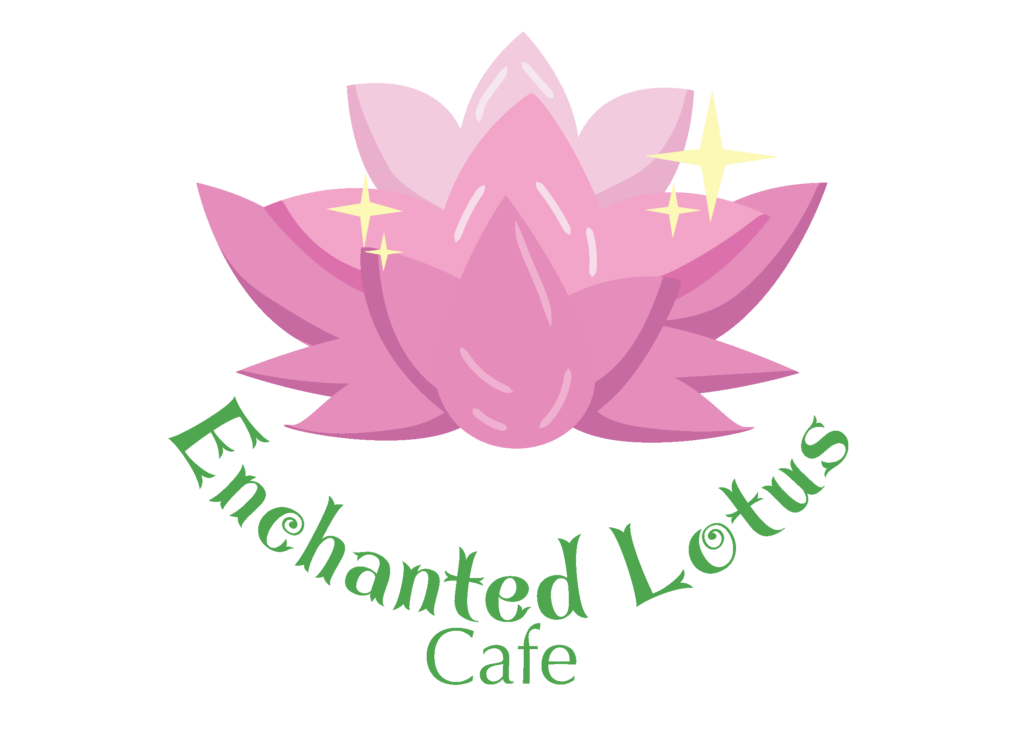

The first version is the logo is something i did in earlier in my design career and i knew that i wasn’t happy with it and that id eventually want to change it. so after learning a lot more in the graphic design field i decided that for sure the knew that the blue and green background had to go. I removed the fairy as well as the yellow circles because they did not look like sparkles as intended. I changed the fonts as well because it didn’t fit the vibe.

First i started by removing all assets from the previous logo. I removed the stroke from the lotus petals, next i drew inside the petals ( in a mask ) to create shadows to give the flower more depth and detail to give it more of that flat Design style.


Next was choosing a new font, i had 3 options and ultimately went withe first option. In the first photograph you can see i added additional petals to the Design since it was looking to blank for my liking.


I changed the yellow circle to actual Stars to give the sparkle effect. I added highlights on the the lotus as well to add even more depth. had to play around with different brushes but as you can see i ending up finding one to match the smooth artstyle.I played around with adding the text on a curved path and after receiving some help from my peers and instructors i ended up putting my text in a circle path to sure thats its alignment was good.


So here’s the finish product with a black and white version . it was made in CMYK so it’s ready to print!
