

How I did it.
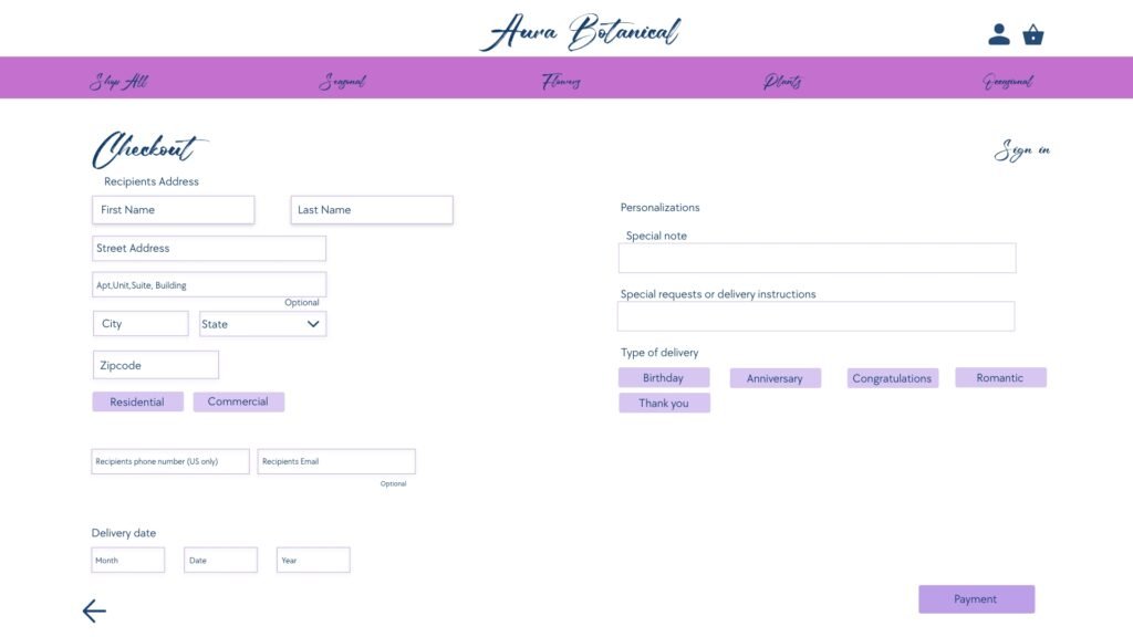
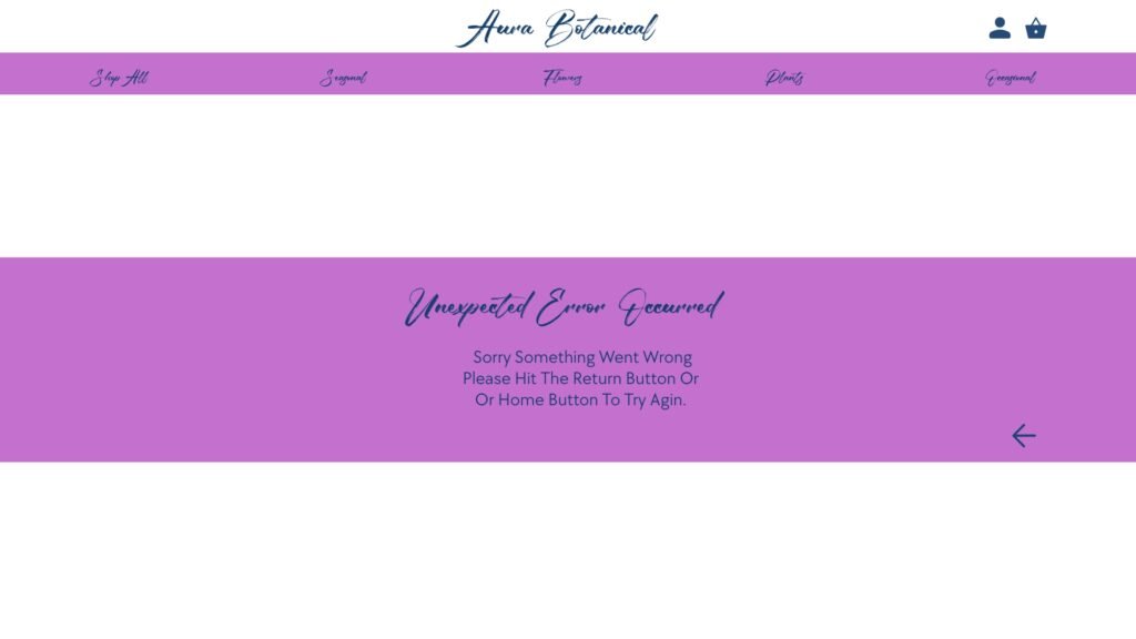
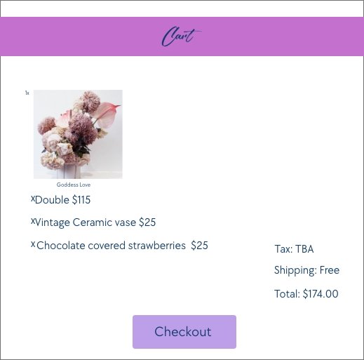
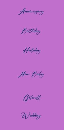
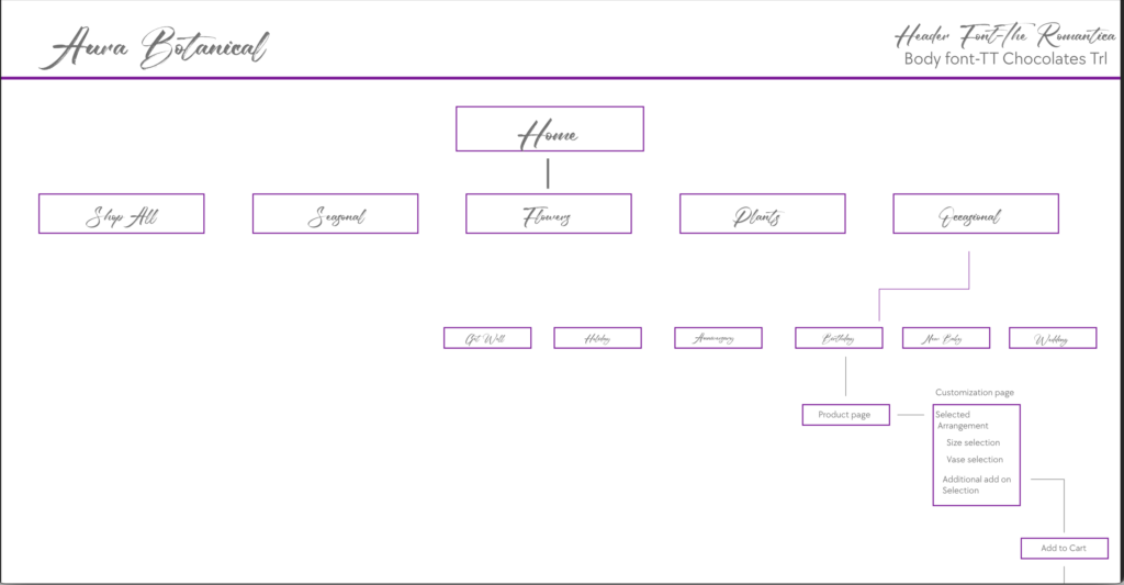
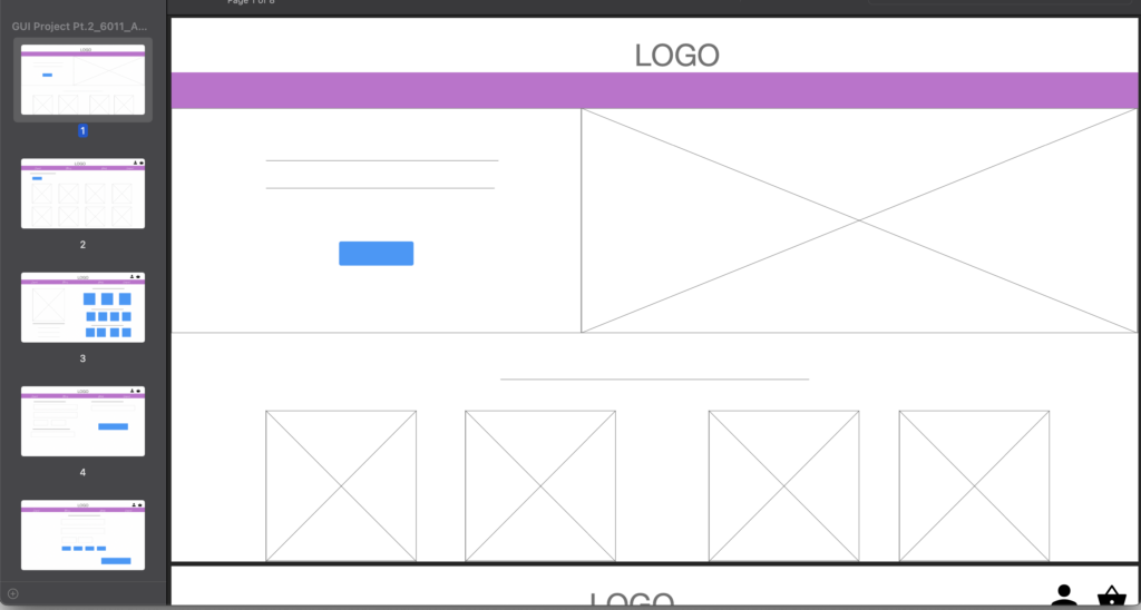
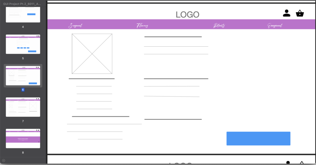
First i sketch a general layout that i wanted then, i created a site map to layout for how the user would navigate the site. Next i made low fidelity wireframing. next was creating a color plate for the size,a decided on the two fonts for the site. next i put everything in place and added all the photos and colored all the text and created High fidelity Wireframe .I created a basic path so the client have a high fidelity preview of how you would basically navigate the site. i created a pop out menu for the check out as well functional icons and buttons for the client to preview. on the product page i also created preview of customization for the product. all in all it was a long process but it was a long process but i really like how it turned out.
Start- Site Map and Low Fidelity Wireframe
High Fidelity Wireframe
