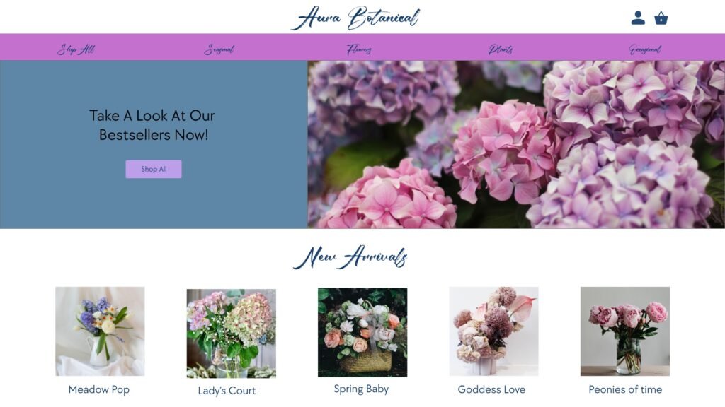

I converted my Flower Shop site into a mobile App. Although i kept a lot of things i Kept the same but there was a lot of major improvements made in the mobile version.
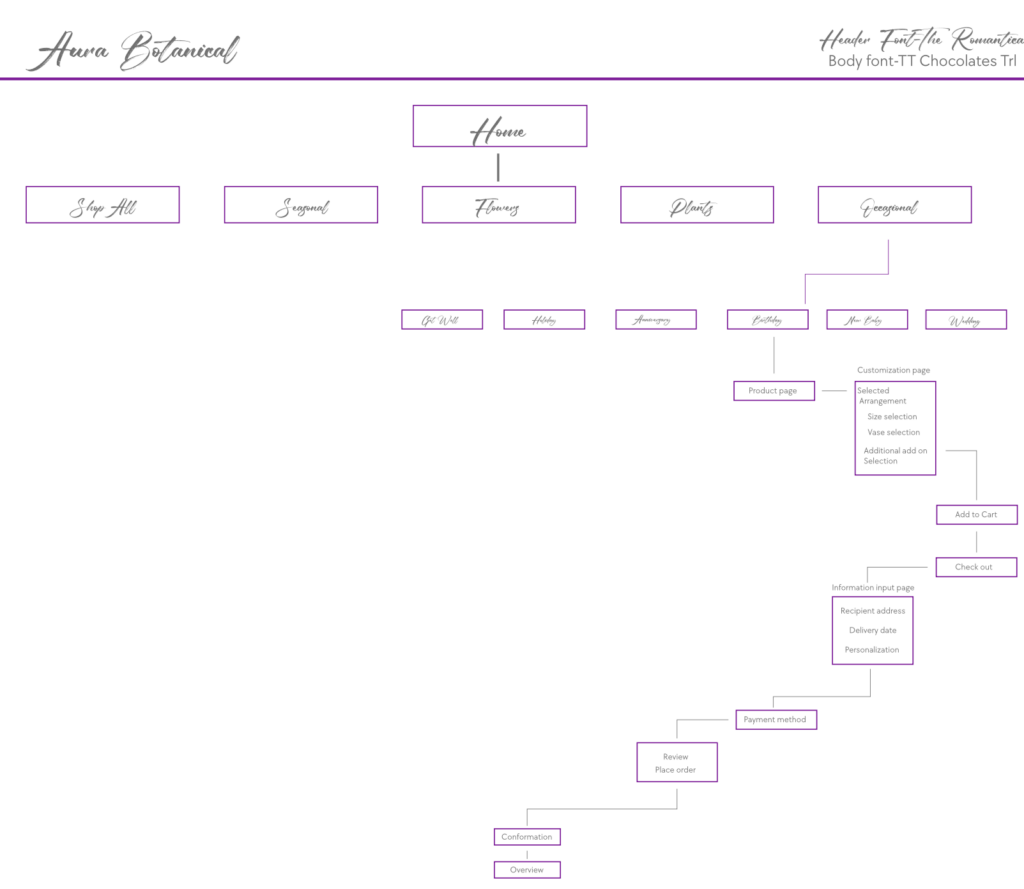

I kept the original Design element from the original site map and of course converted it into a mobile format. so they layout stay pretty much.
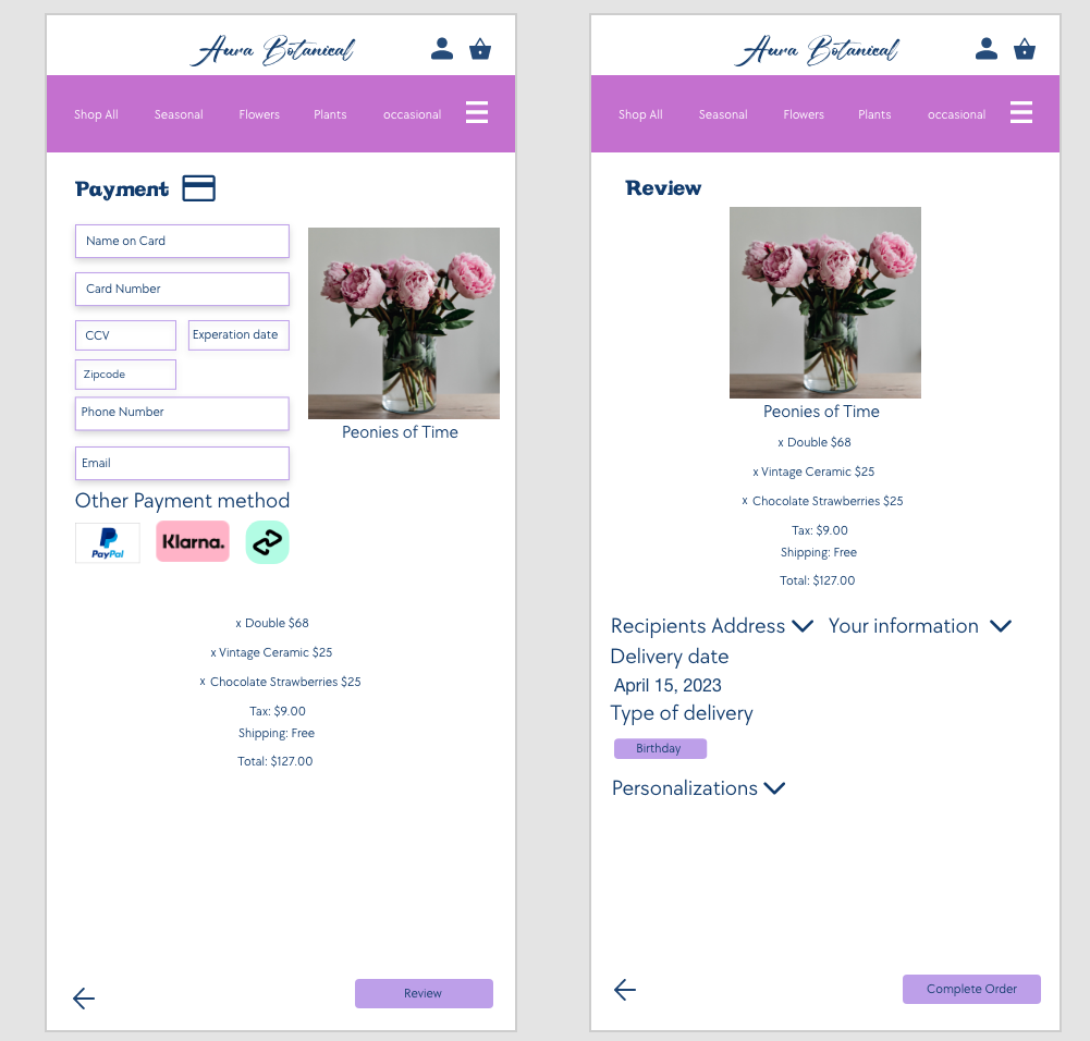
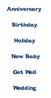
These two pages where a bit hard for me to do and trying to figure out the best layout for such a long narrow canvas. However as you can see the biggest change is the text in the navigation Bar and the as well as the header font. After receiving feedback i learned that the original Font was hard to read, so i changed it to a simple font in White to improve the readability. I also went a Serif font for the header instead of the script one in the logo to also insure the best readability.
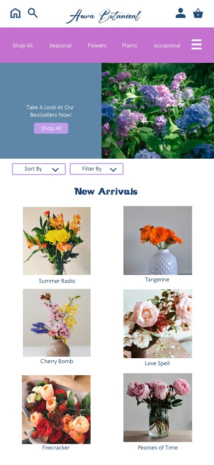

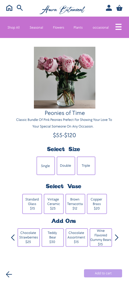
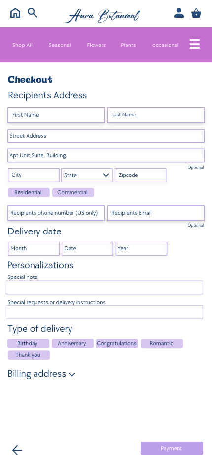


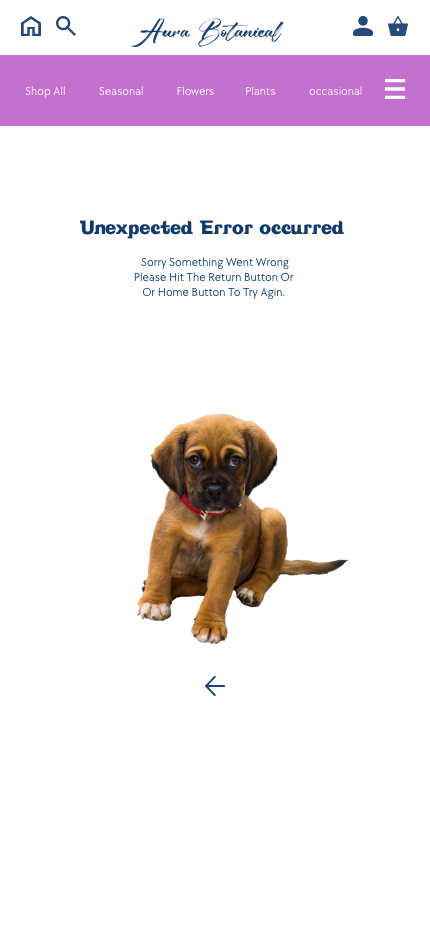
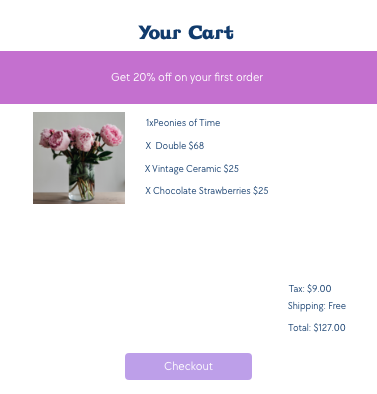
In addition i also added a home and Search Button. Original the Logo was the home button however, there’s really no clear indicator that its the home Button so i added one to insure the best user experience. The search button in general was missing so i went added one in.
